Concept
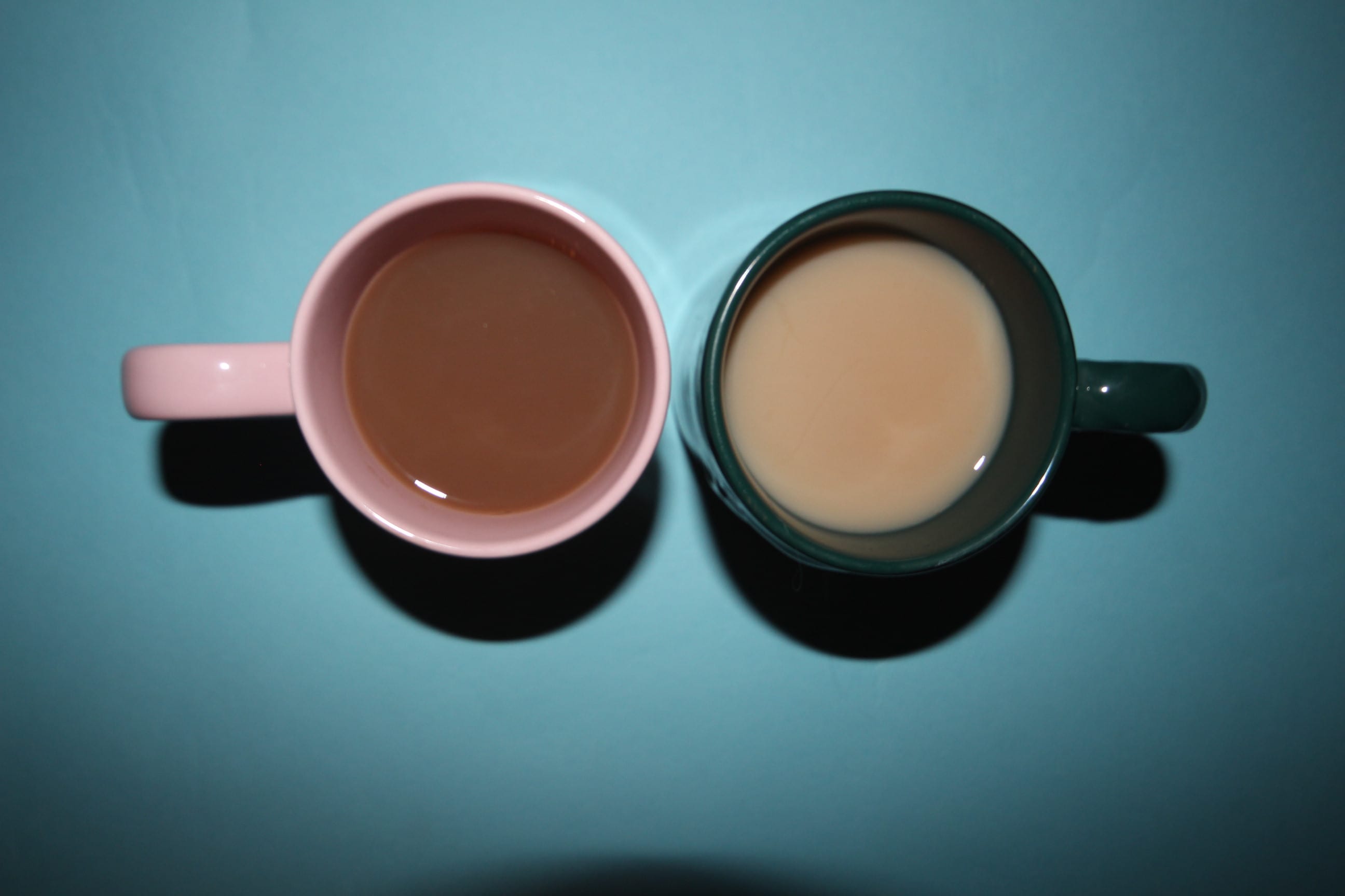
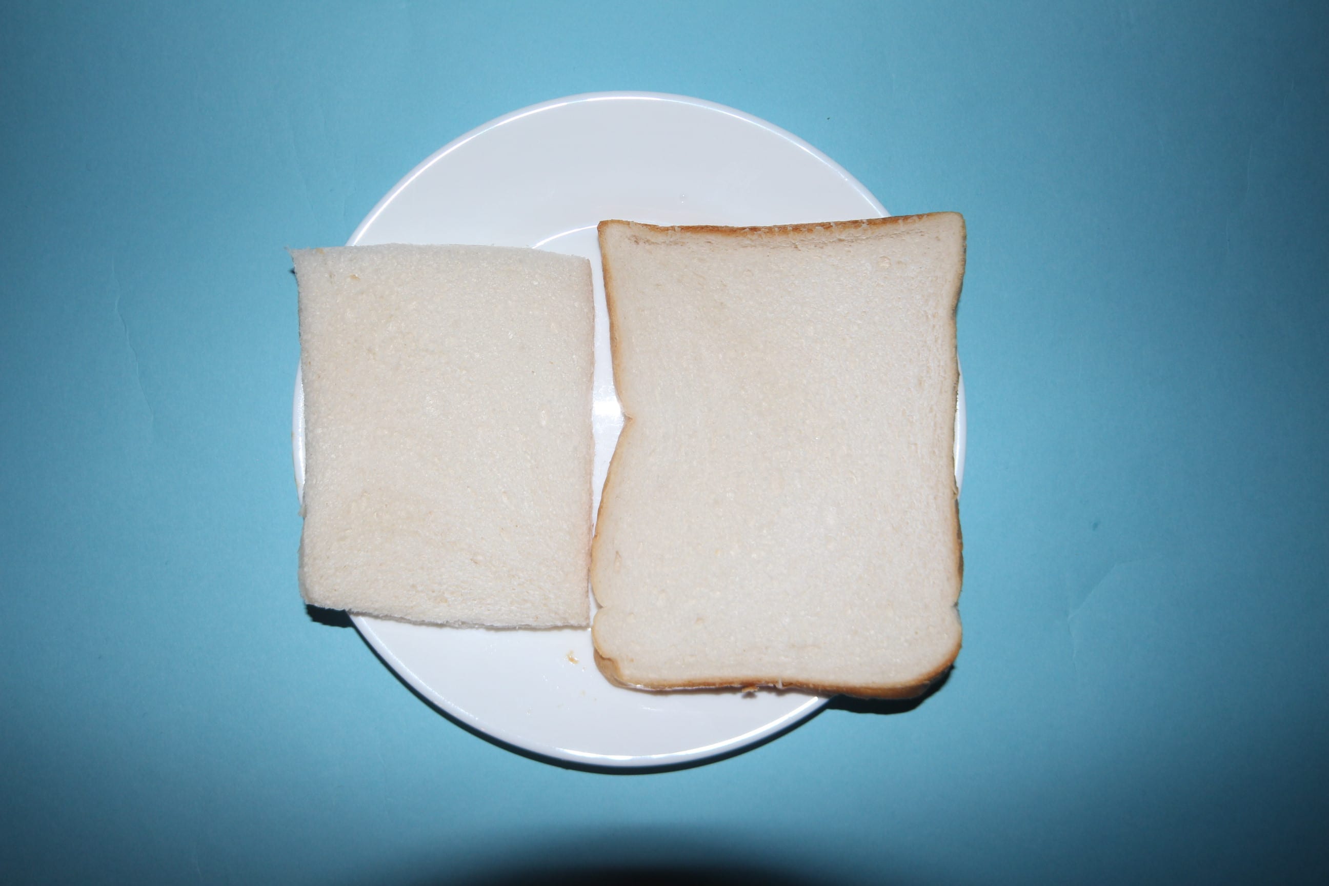
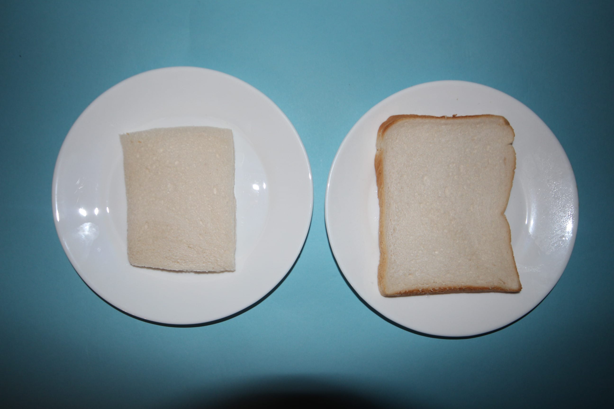
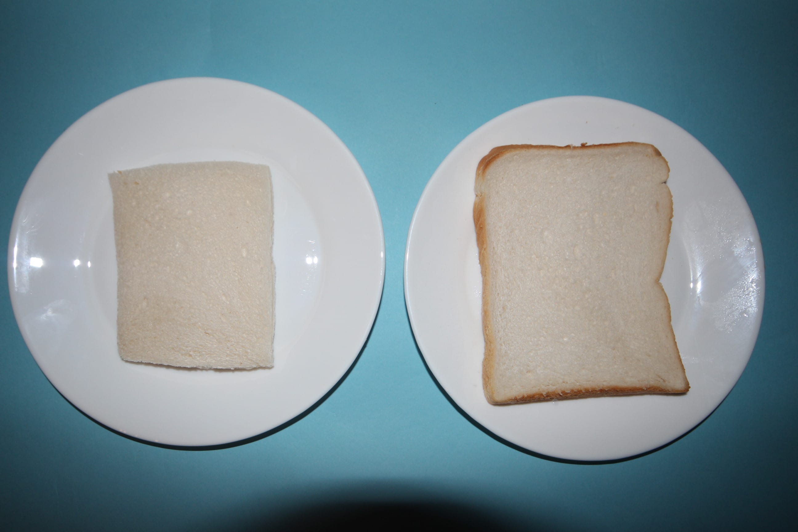
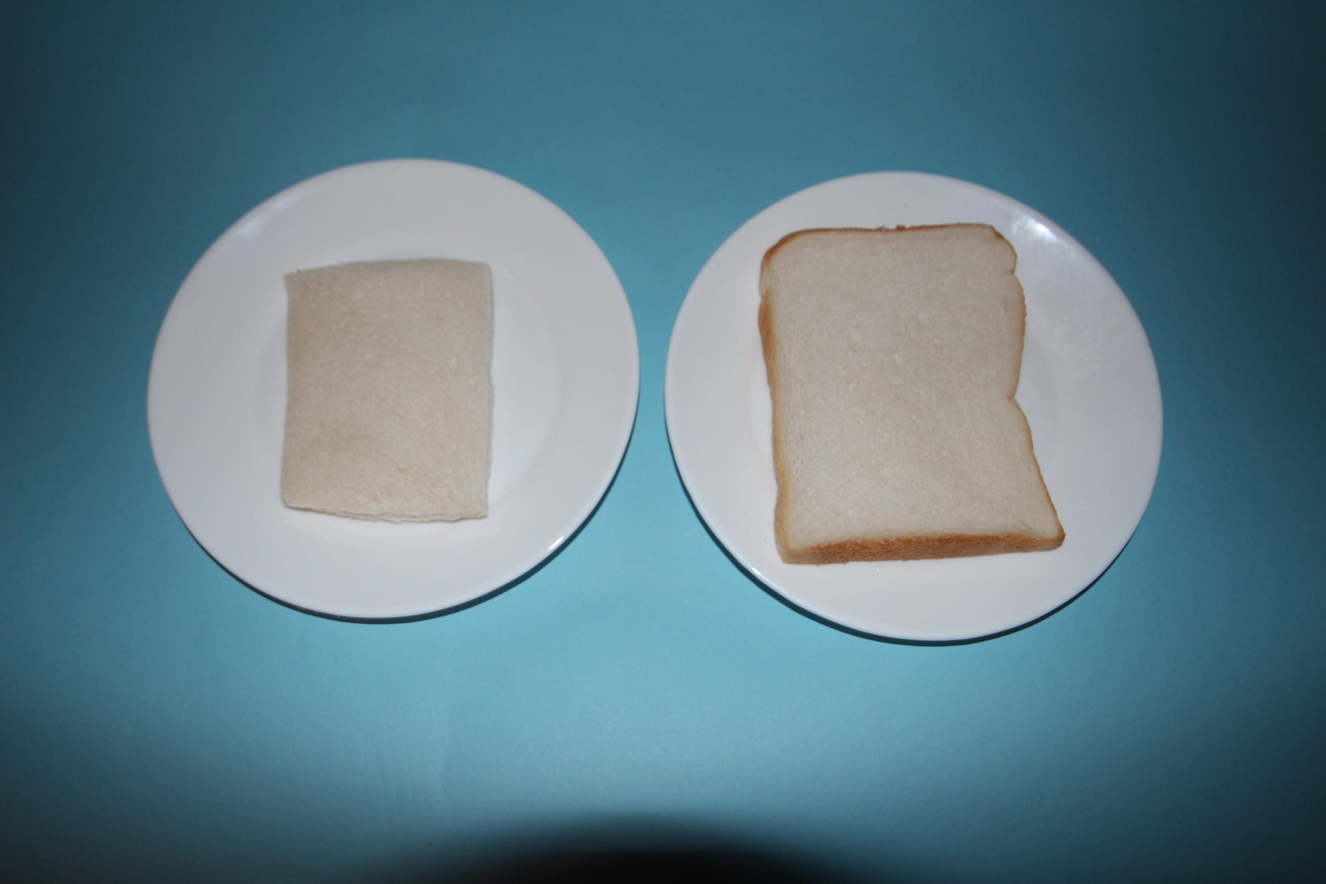
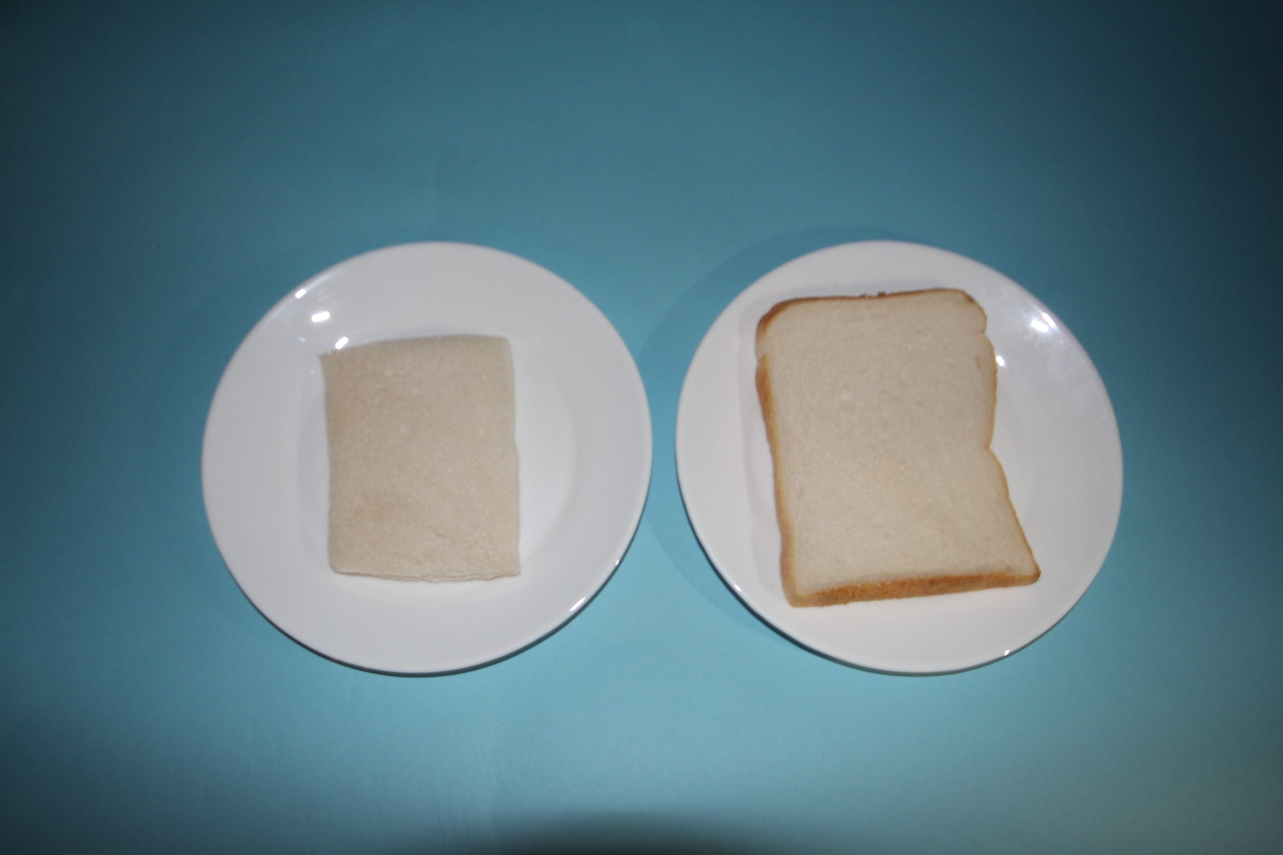
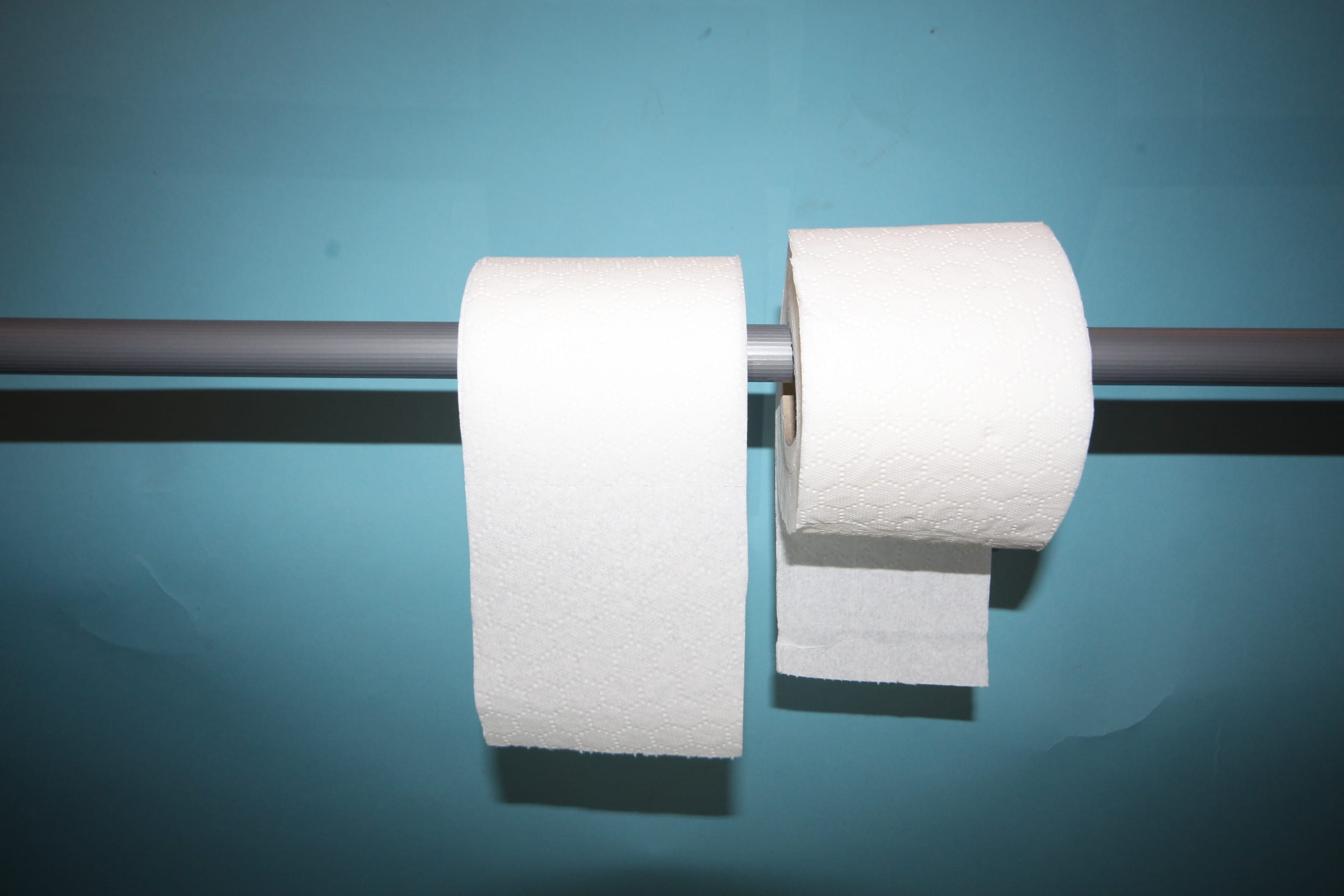
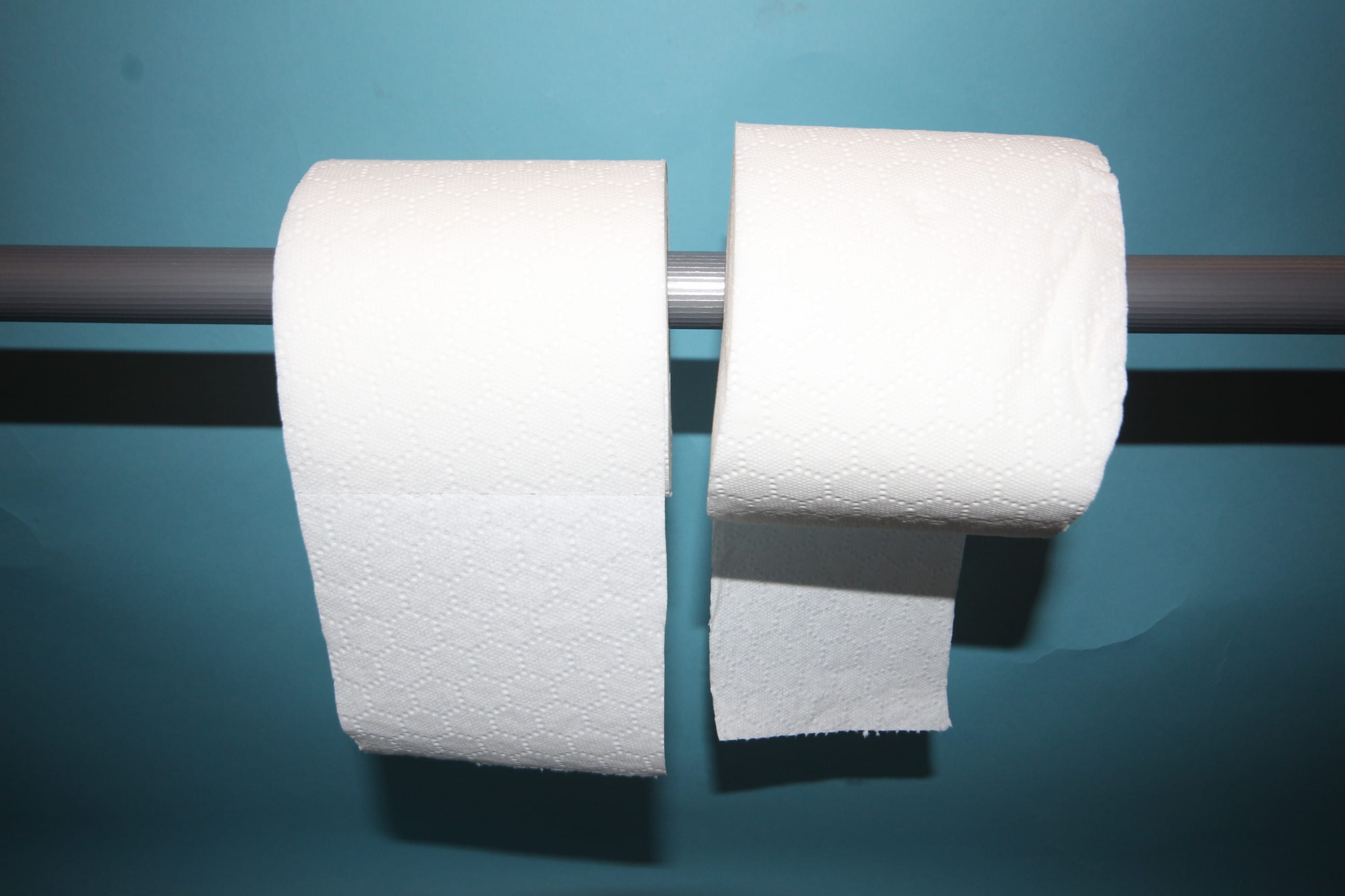
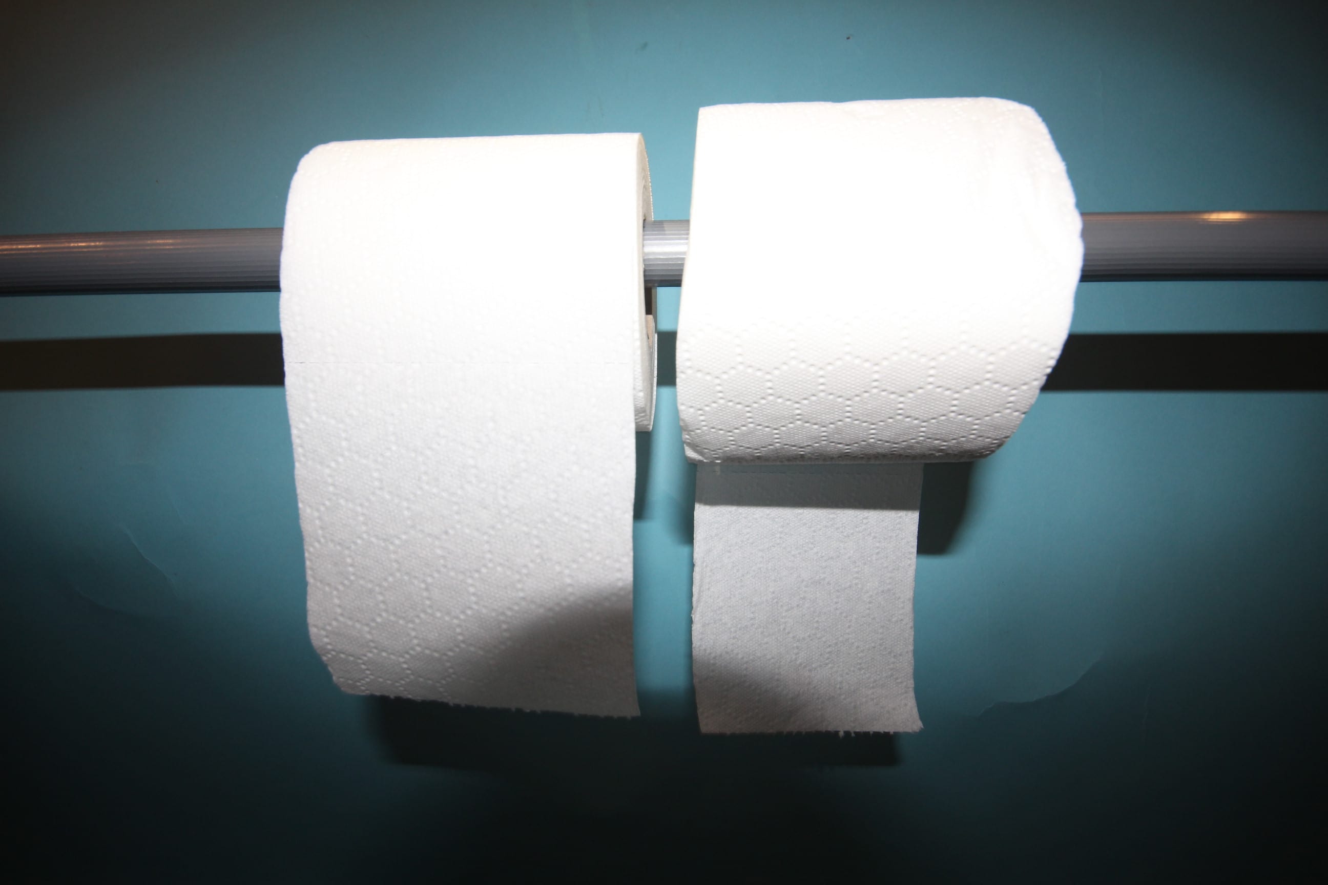
The images that I selected represent small things that many people collectively have a strong opinion on which is the “right” way to do it. I took the images over a two-day period and aim to cause the viewer annoyance [or in some cases- rage] over one of the options presented. The idea came about after I read an article [which I will mention in the next section] that “solved” an apparently worldwide debate over which side the paper should go when you refill the toilet paper holder. I found this quite amusing and wanted to explore the many other things that can cause humans distress when they don’t seem to matter. It ties into the theme of Division as it showcases how people can debate topics of little importance and hold firm beliefs about everyday mundane items/themes we encounter frequently.
In a way, I wanted to prove how humans by nature want to make a big thing about nothing. I am one of those people, but from just showing my pictures to people in my every day life- it has become more and more apparent it’s not just me.
Influences
The Daily Mail
As mentioned above, I read an article by the Daily Mail with the headline, “Over or Under? The age-old debate of which way a roll of toilet paper should sit is FINALLY settled…” which grabbed my attention one uneventful evening. [article found here: http://www.dailymail.co.uk/femail/article-3002112/Age-old-debate-toilet-paper-settled-patent-1891.html]
The article basically “settles” the argument with an apparent 124 year old diagram demonstrating which way the paper should sit; discovered by writer Owen Williams.
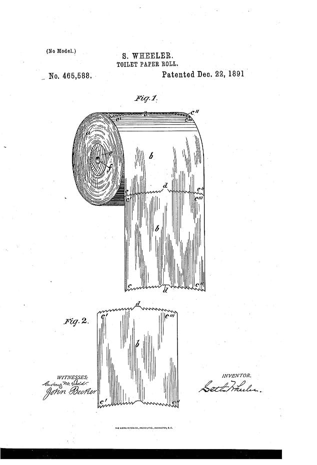
I found the article both amusing and interesting; I figured it could be a good basis for my project of Division.
Fototazo
My second influence was an article on the page “Fototazo” [http://www.fototazo.com/2012/04/opinion-pantall-colberg-hoepker-and.html}. During the article, the author references Colin Pantall’s observation of how people struggle to look beyond what they see in an image and take it for face value. Or in the articles words:
“Pantall uses the image to point to the problem of the narrow emotional range accepted in the responses of photographic subjects to a situation, as well as the difficulty many people have coping with something beyond the simplest of narratives in a photograph. I would continue his points by adding that there’s a problem with the assumption that it is possible to come to any correct reading of the emotional state of photographic subjects and in believing we can correctly conclude the narrative of a photograph in any way.”
-http://www.fototazo.com/2012/04/opinion-pantall-colberg-hoepker-and.html
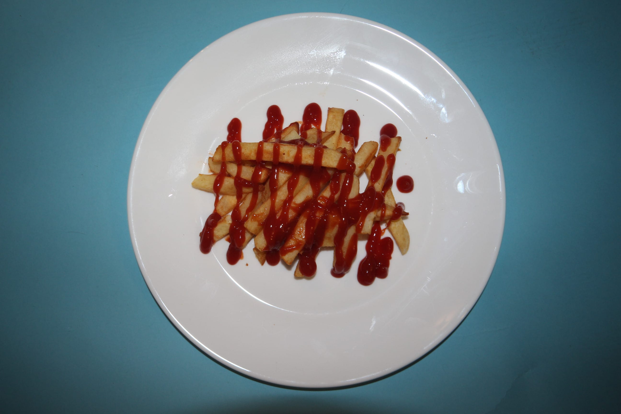
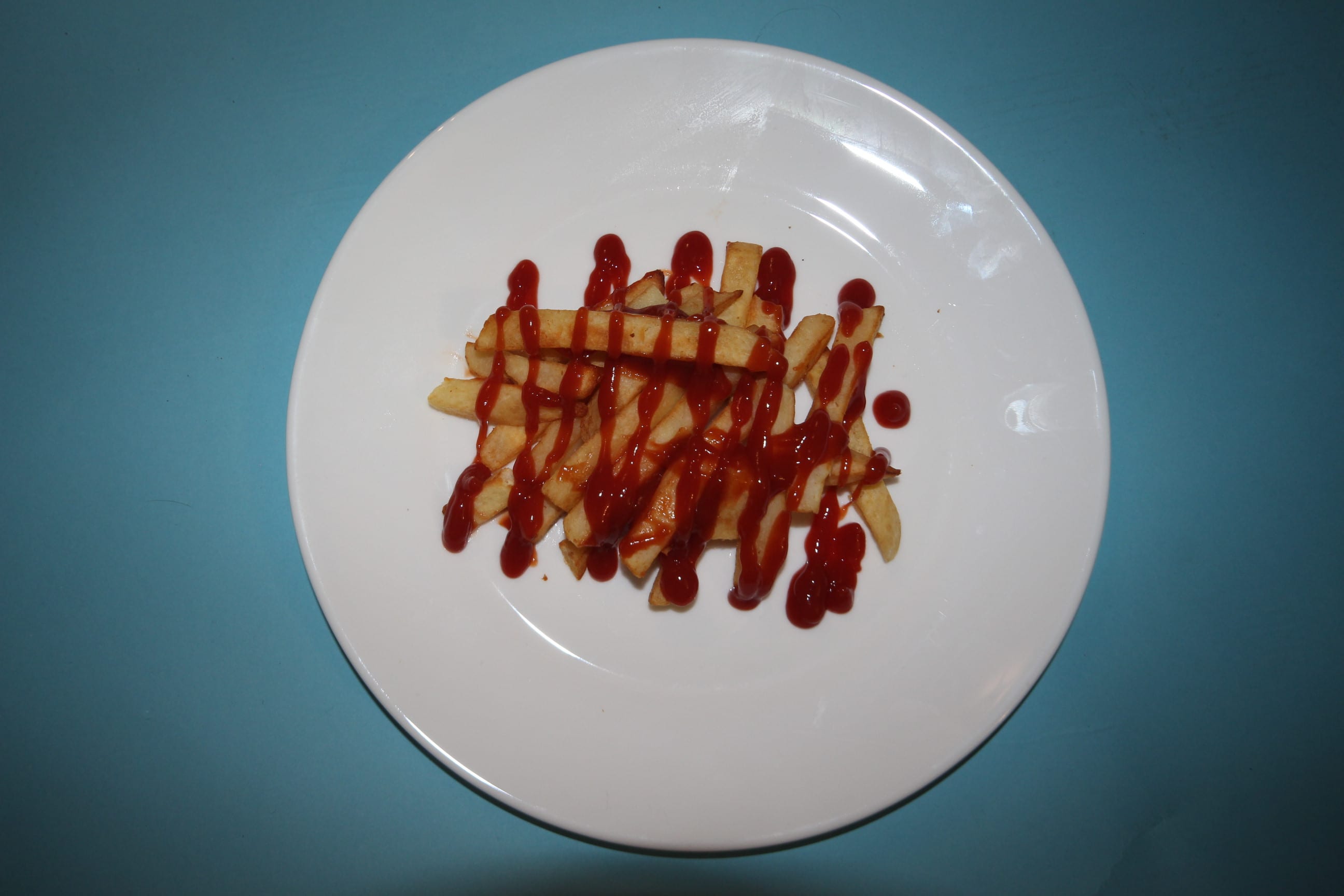
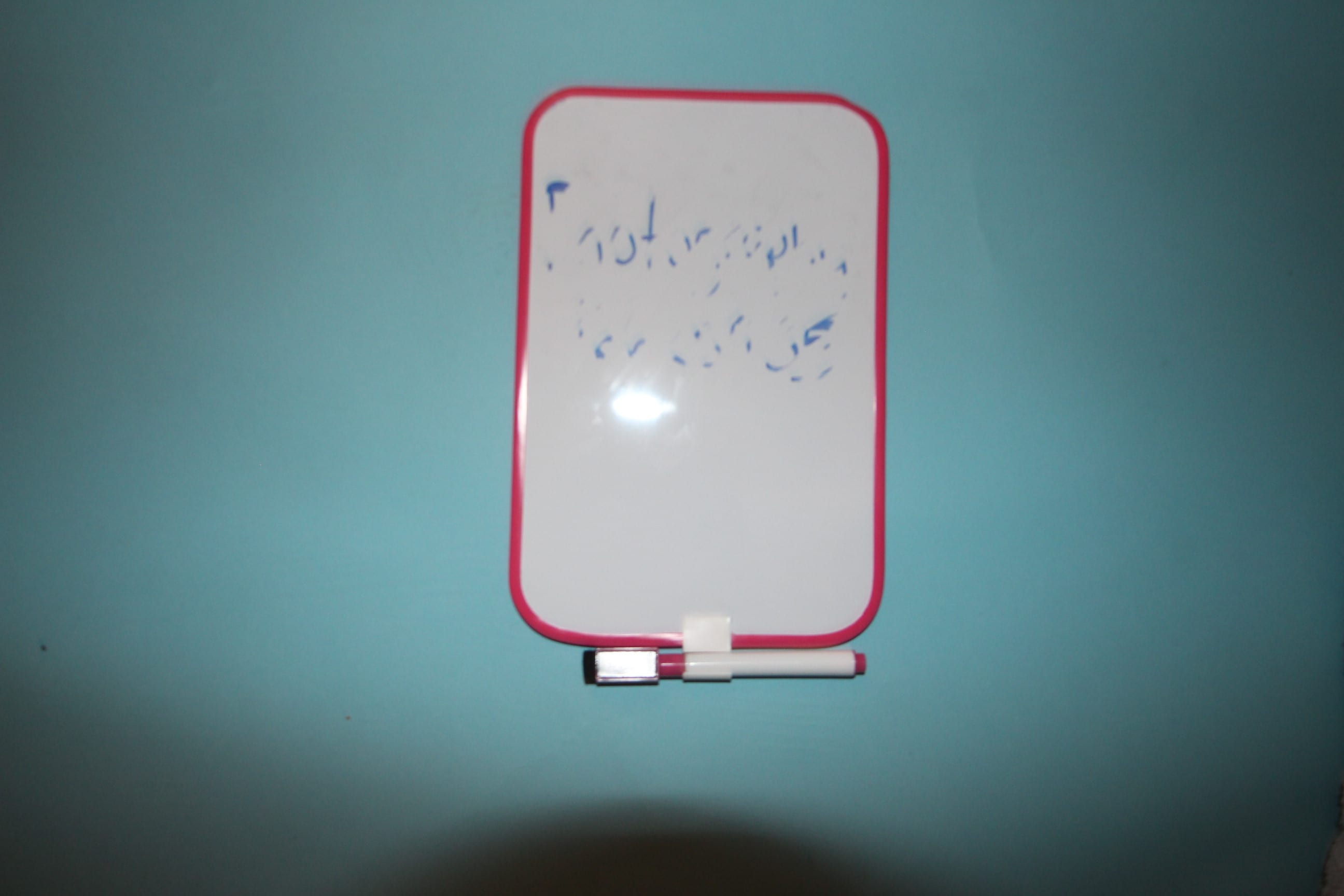
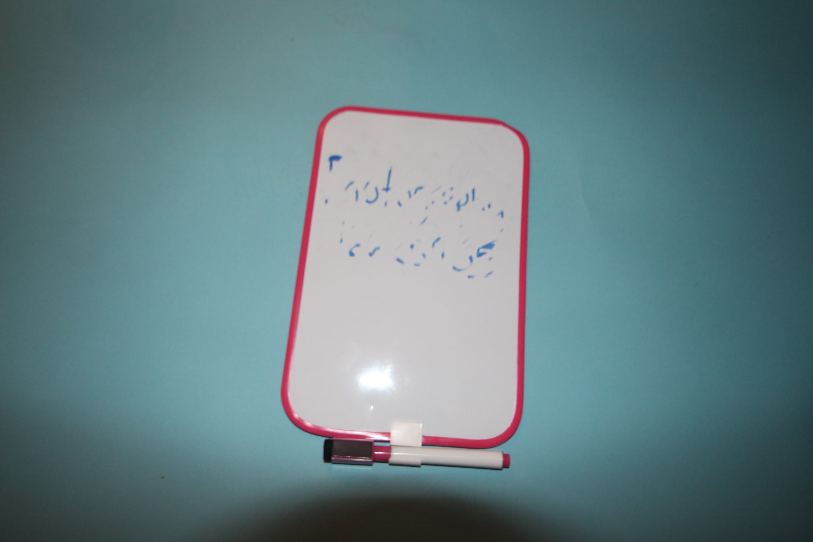
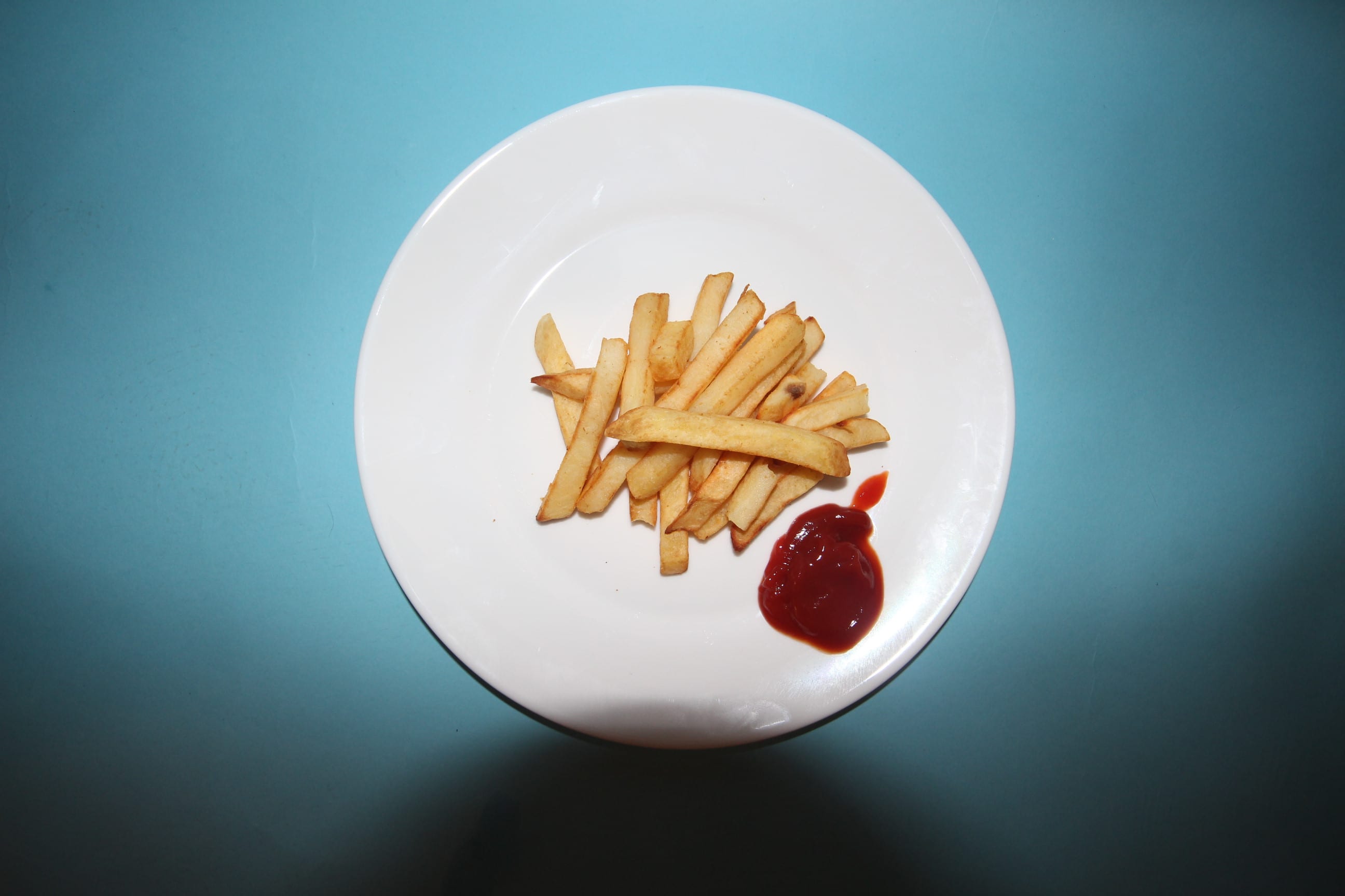
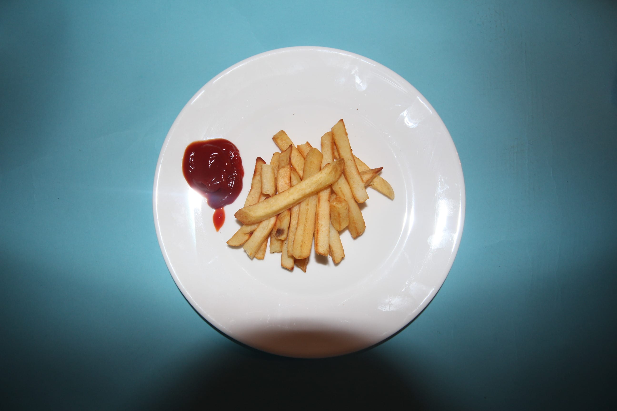
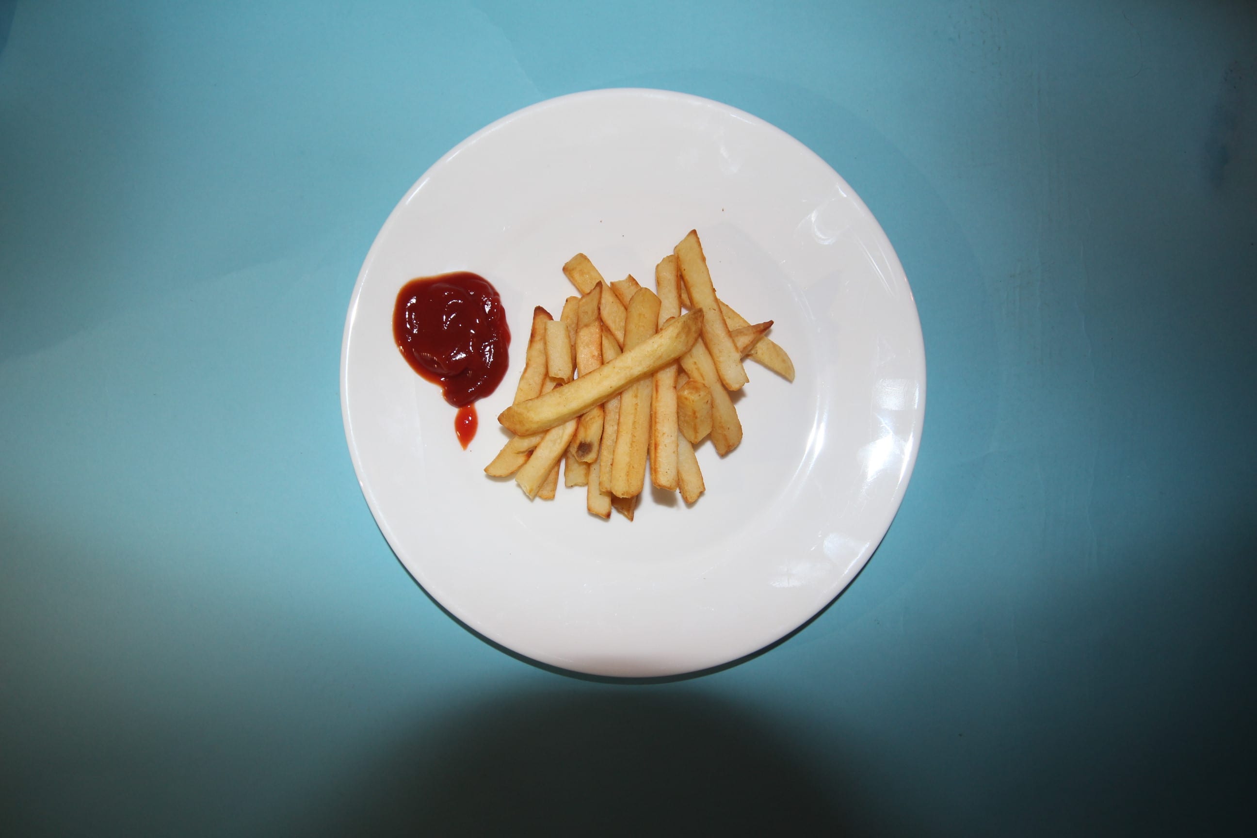
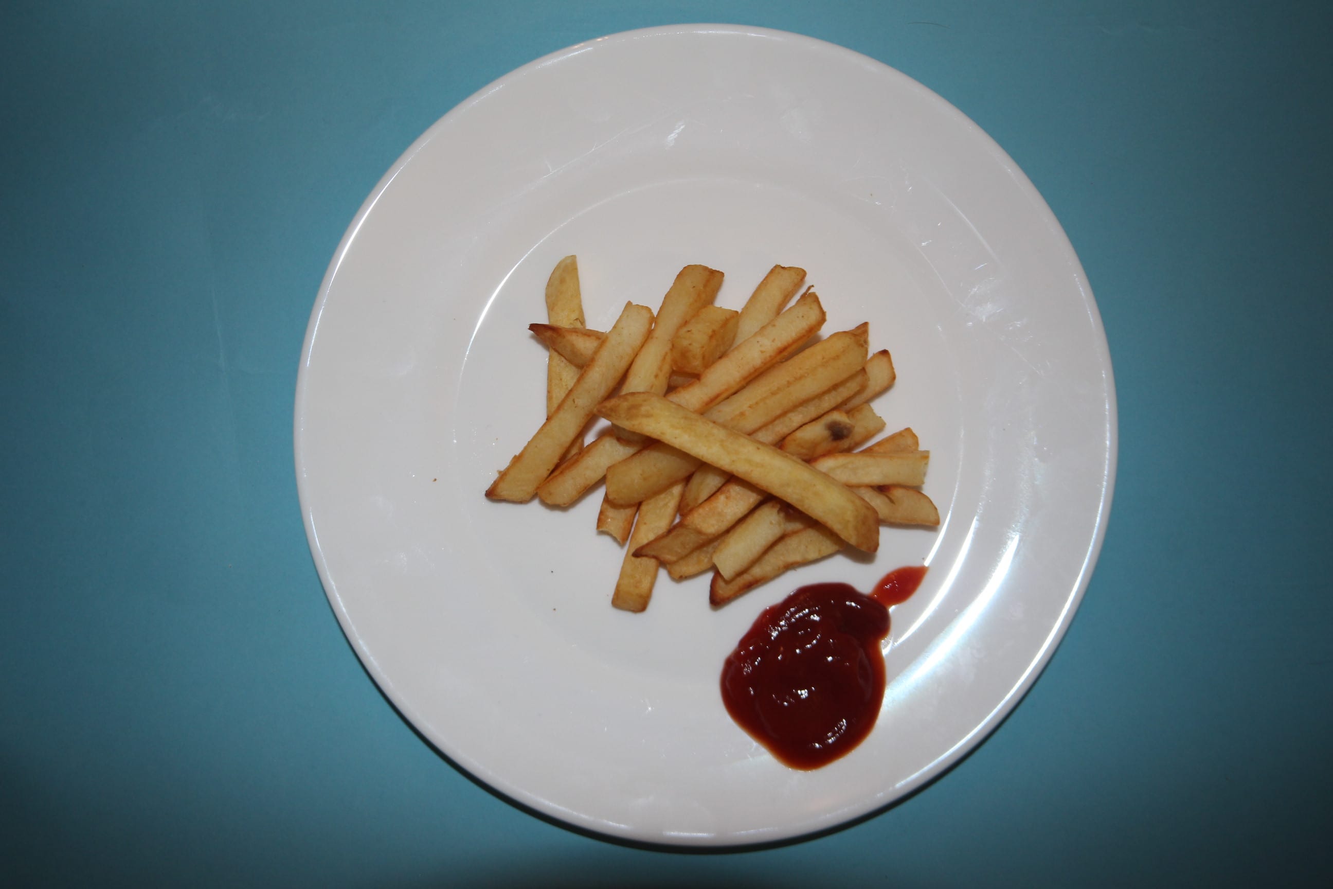
Whilst this isn’t directly a theme I tackle in my project, I still think it’s relevant to the concept I have chosen. In my case, people perceive things in different ways even at face value, but that perception can provoke emotion when it tackles personal preference. For example, in the process of making the images, whilst I was covering the plate of chips with ketchup- it caused me physical pain to “soil” such a perfectly good plate of chips. Just as, when getting some informal feedback on my whiteboard image- I had caused the person distress that the whiteboard wasn’t completely clean like on the other half.
Alternatives
Reflection
This project has been a nice introduction into photography and the topics you can explore. Going into the project, I wasn’t quite sure if my concept was good enough- but over time I have found this to be a different take on “division” and despite not being overly happy with my work; it has been a huge learning curve in terms of creativity, technique and persistence.
I chose subjects that were inanimate as I believed this would give me an easier idea to work with, but looking back at previous work over my blog, I realise that I prefer working with more alive subjects as you can direct them. You cannot direct a toilet roll.
Regarding the images themselves, I felt that even though they’re not exactly the best images out there- I tried my best with what I had and felt the images seem to all have the same “vibe” and obvious relation. I kept to a blue background, dark shadows and tried to keep the accessories as plain as possible. However, I would’ve much more preferred to have had access to more lights as there is only so much you can achieve with a phone flashlight. I liked my idea a lot, but my vision seemed to collapse around me as it became more clear how I wanted it. If I was to recreate this project, I’d have a better lit set, purely white plates and mugs and have featured a much cleaner look to it.